 Uniforms
 Uniforms
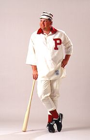
This is one of the Phillies first uniforms, from 1899. Though John Kruk models it with the shirt untucked (the slob!), one can easily see that the look was far more formal. Something tells me, though, that Nike cleats weren't the fashion must then that they are today.
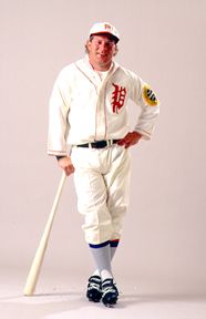
The prominent feature on this uniform, from 1925, is obviously the Old English scrpit P. It almost seems that the Phillies were once sponsored by the Philadelphia Inquirer, just like a little league team. That's OK, though, because in the 1920s, the Phillies played like a little league team. At least Lenny Dykstra has the look down right.
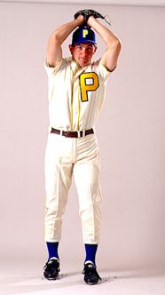
Now here is an odd effort. No one is exactly sure what motivated Phillies management to trot their team out in these abominations in 1938, but it makes for an interesting conversation. Remember, the Phillies played their first season in Shibe Park in these things. The biggest question is how the team colors went from red and white to blue and yellow. No matter what, you must agree that Terry Mulholland was very brave in agreeing to wear this for a photograph.
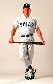
Apparently, after those 1938 things, the Phillies needed to do something to win back the fans. So, in 1942, as any red-blooded American team that wants to appeal to the mass populous would do, they switched to a black uniform. Sure, these look pretty good (of course having Darren Daulton in the uniform helps), but where's the charm? They look like Pirate uniforms with more gray. Bah.
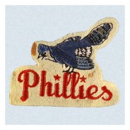
Now, here's something interesting. I couldn't find a uniform picture to match this logo, but I still want to include it. Yes, that is a Blue Jay in with the Phillies logo. The uniforms from the time are basically blue and white, with the word "Phillies" written in script across the front, much like today. This logo, from 1944-1945, led to the press referring to the Phillies as the "Philadelphia Blue Jays," and indeed the team announced that they wanted to be referred to as the "Blue Jays" (though apparently they were too cheapt to change the official stationery to reflect that, a fact which today allows them to make the false claim that they have the longest continuously-used nickname in professional sports). However, I'm sure you, like me, are not fooled. This is clearly evidence of a conspiracy on the part of certain parties interested in legitimating Canadian baseball to throw the 1993 World Series in the Blue Jays favor. What other possible explanation could there be!?
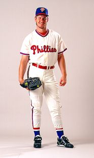
Now here's a classic. Obviously, these 1948 uniforms resemble the Phillies current ones. Now, I must say I prefer the pinstripe look, but this is a classic Phillies uniform, nevertheless. If the Phillies adopted this or something like it, I would be just fine with it. I especially like the hat (I even own one!). They should use the two-tone, royal blue crown and red bill look as their road hat. I'd love that. See, even Mitch Williams looks comfortable in this Phillies uni!
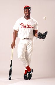
Well, if you don't like our current uniform, you sure won't like this one. Sure, our current uniform features a splash of blue, and the script is a little different, but it's essentially the same. Actually, I like the splash of blue, its something I think is sorely missing from this version of it. But hey, Wes Chamberlain looks happy in it.
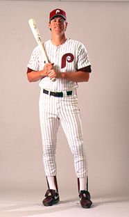
Considering how unimaginative this uniform really is, it is amazing that they kept it for 22 years. The Phillies enjoyed their best years in this uniform, of course, and maybe that's why it lasted so long. But it really was embarassing when the Phillies were wearing this disco jump suit in 1991; if you're wondering what I mean, just think about showing up to a wedding in 1991 in one of those 70s tuxes. Although I must admit they look sharp as a change-of-pace when the Phillies occasionally wear them for a turn-back-the-clock day in this day and age, they really are essentially maroon Yankees uniforms. And yes, that IS Dale Murphy modeling for the nice people.
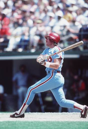
One of the more unfortunate 1970s fashion trends was the use of Carolina blue as a team's road color instead of the traditional gray (a trend I fear may be returning with the debut of the Padres SAND colored road uniforms and the sudden ubiquity of Carolina blue). The combination of the Phillies maroon with this powder blue induces not respect but nausea in me and probably everyone else. At least the Phillies weren't the only ones to think this was a good idea; the Braves, Expos, Cubs, Brewers, Cardinals, Blue Jays, White Sox, Royals, Twins, Rangers, and Mariners have all sported blue road uniforms at one time. And they all looked ugly. But today's emphasis on the "retro" look may make these fashion faux pas relevant again!
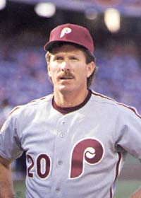
Well, at least they were willing to admit their mistake. After 19 years of the blue road uniform, the Phillies switched back to the gray. It's the same uniform, essentially, just a more sensible color. Of course, it was short-lived. After just one year of wearing this uniform on the road, the Phils switched to their current style, and they stopped wearing it. As a final note to the uniforms from 1970-1990, none of the ones shown here even approach the ugliest. On a Saturday evening at the Vet in 1979, the Phils came out in uniforms that were esentially a reversal of their usual home uniform, minus the pinstripes. They looked something like this, excusing the smallness of the photo:

That's right; they came out in maroon uniforms with white lettering and trim. There is an example on display at the Hall of Fame, in the "ugliest and most bizarre" uniforms section. Hey, at least we put on a show.
As for our current uniforms, look aroud my web site, you will see them. They are very nice, I think, distinctive and sharp. Indeed, I am annoyed at the Angels who more or less copied us (actually, they copied those weird mid-90s red Rangers uniforms, which were most definitely copies of the current Phillies uniforms). As retaliation, I think the Phillies should launch an offensive on the Western front, creating a perimeter around Los Angeles, using the Pacific Ocean as a natural border. Or, they could just adopt a two-tone road cap like the one from the 1948 uniform, though there are those who would say that would make them too Cubs-like. *Sigh.* I like blue. Well, that's it.